FH Paragraaf

Try for Free

FH Paragraaf

Try for Free

Gallery →
Information

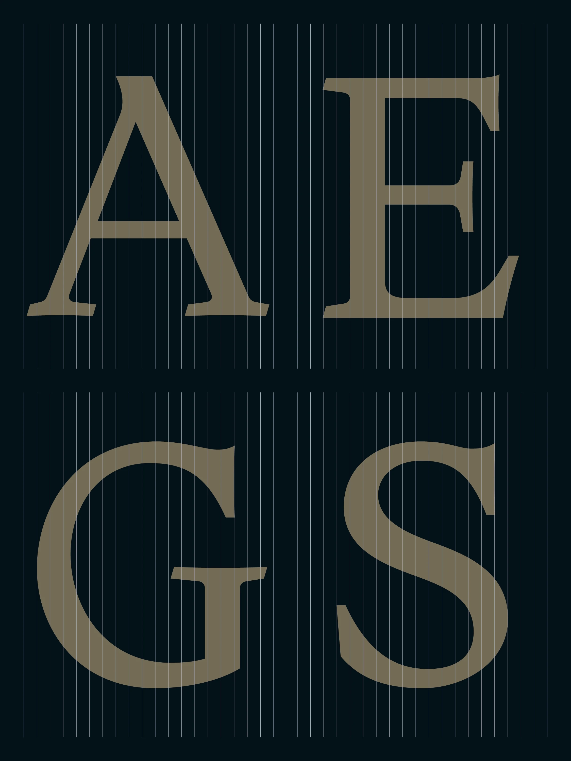
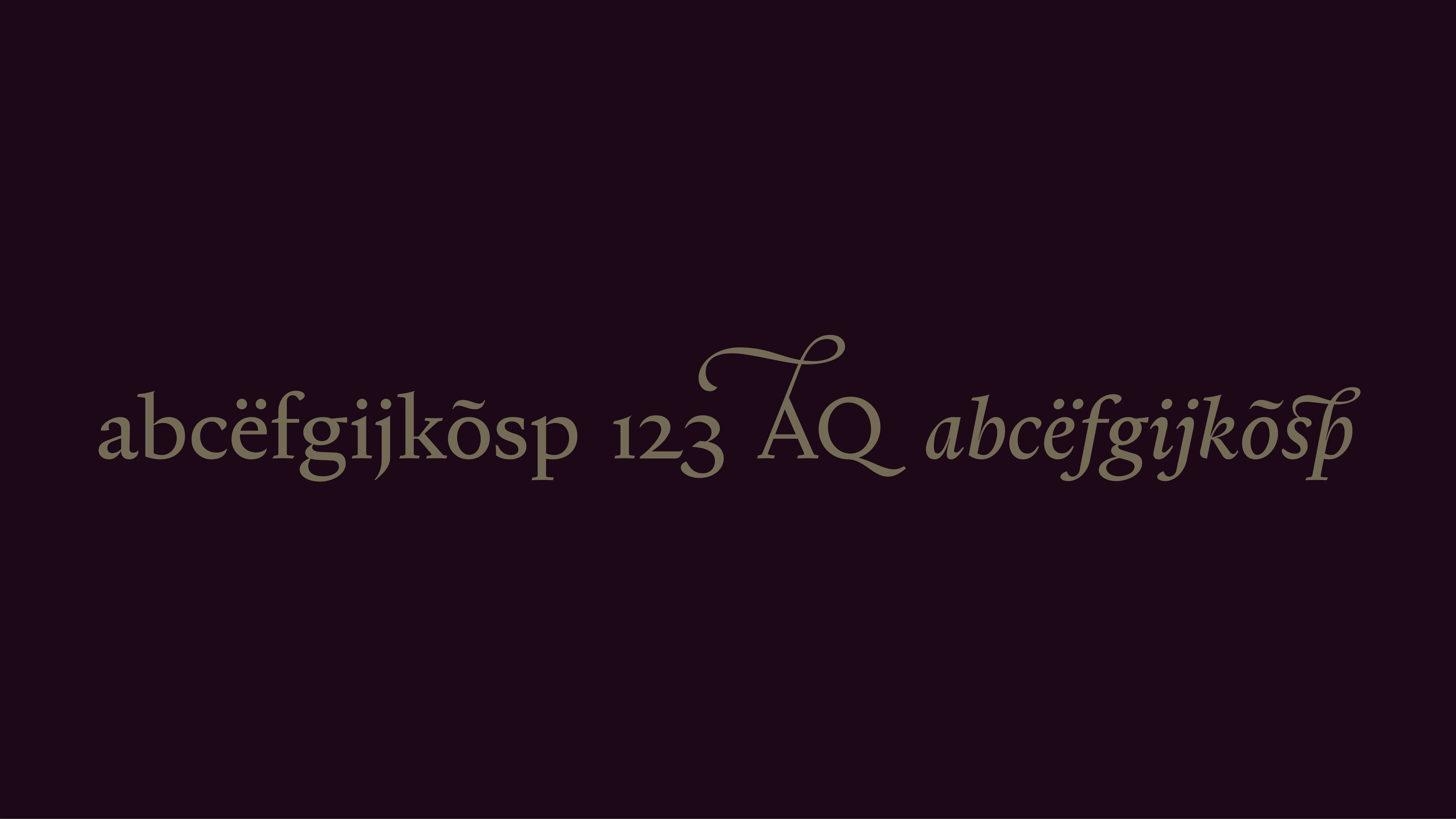
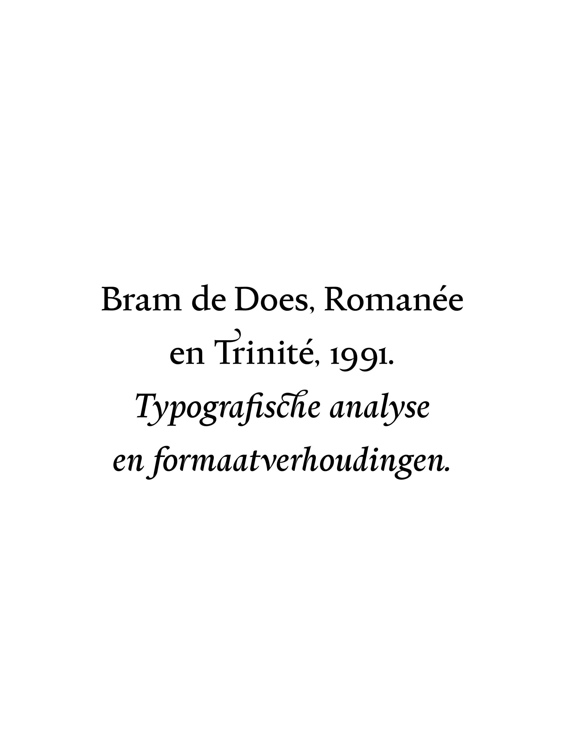
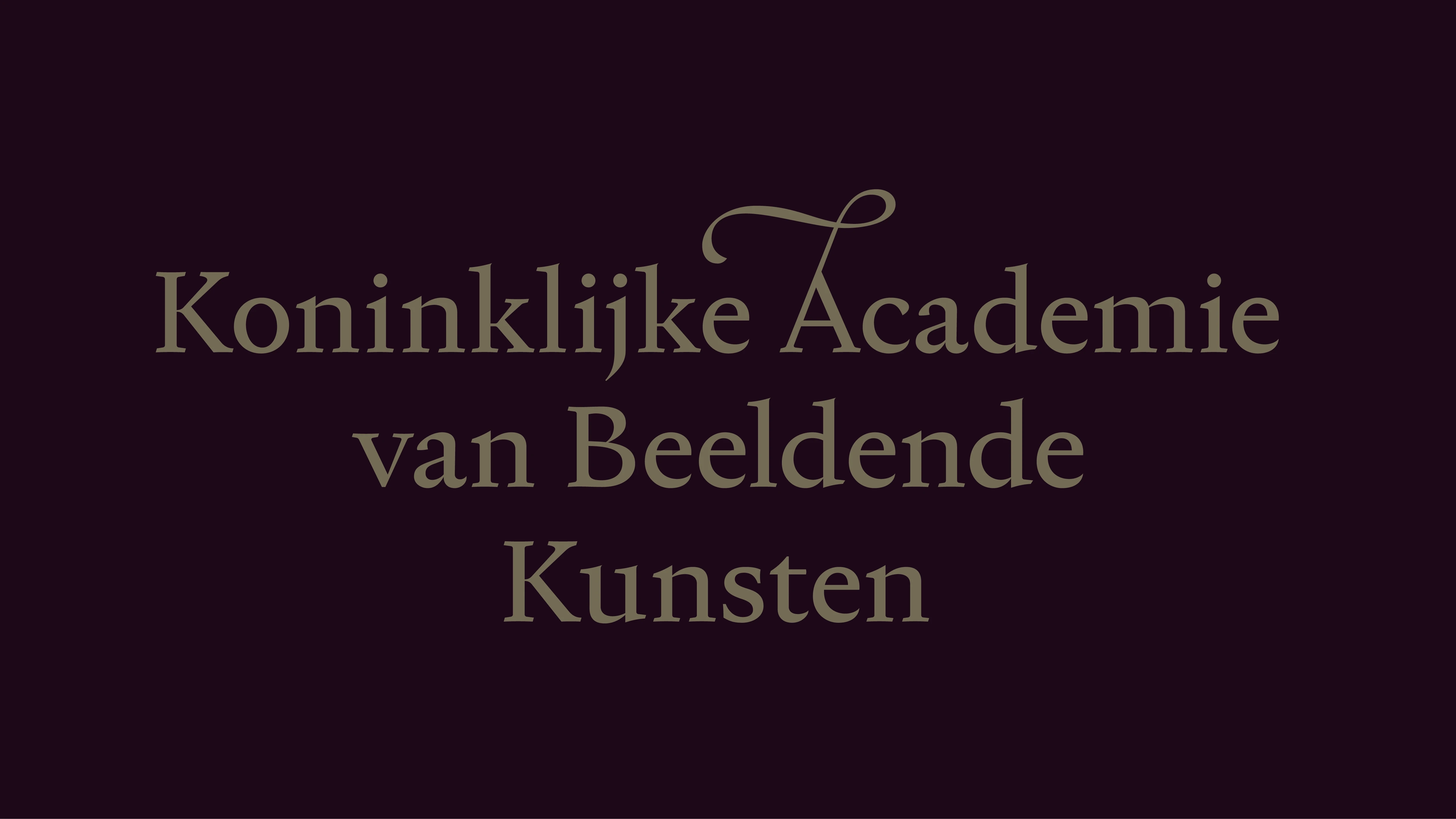
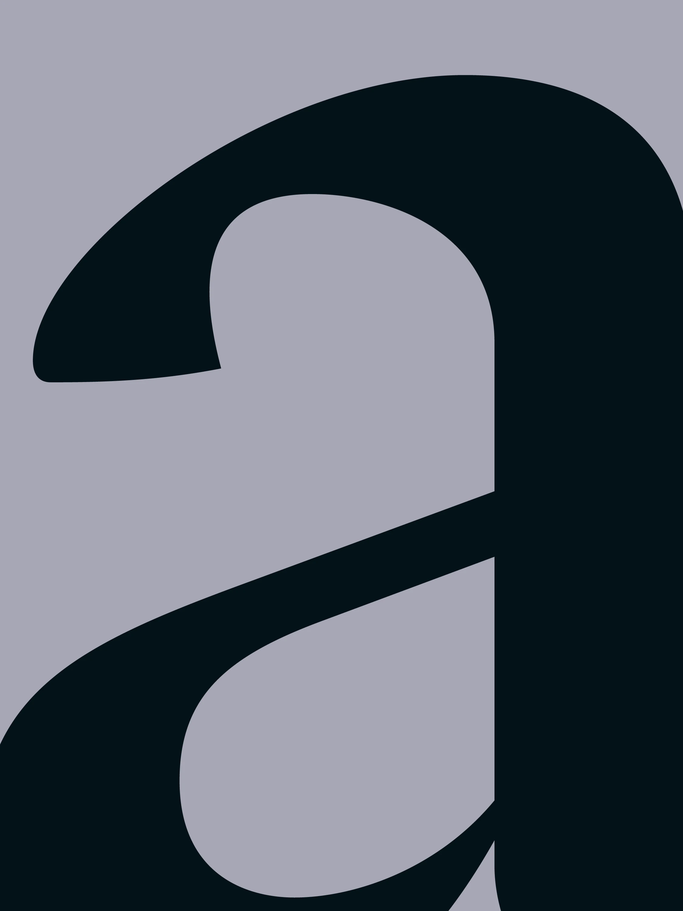
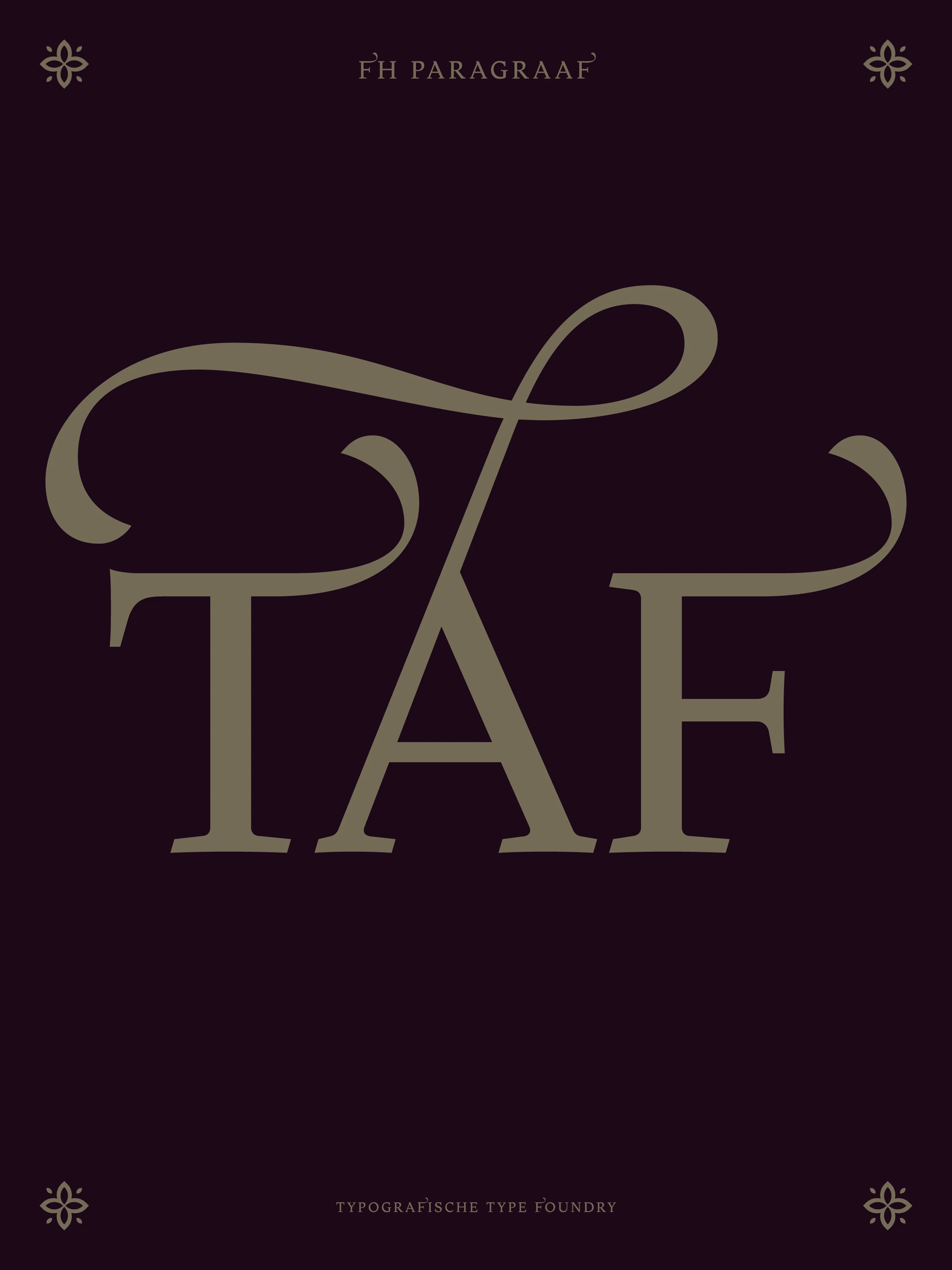
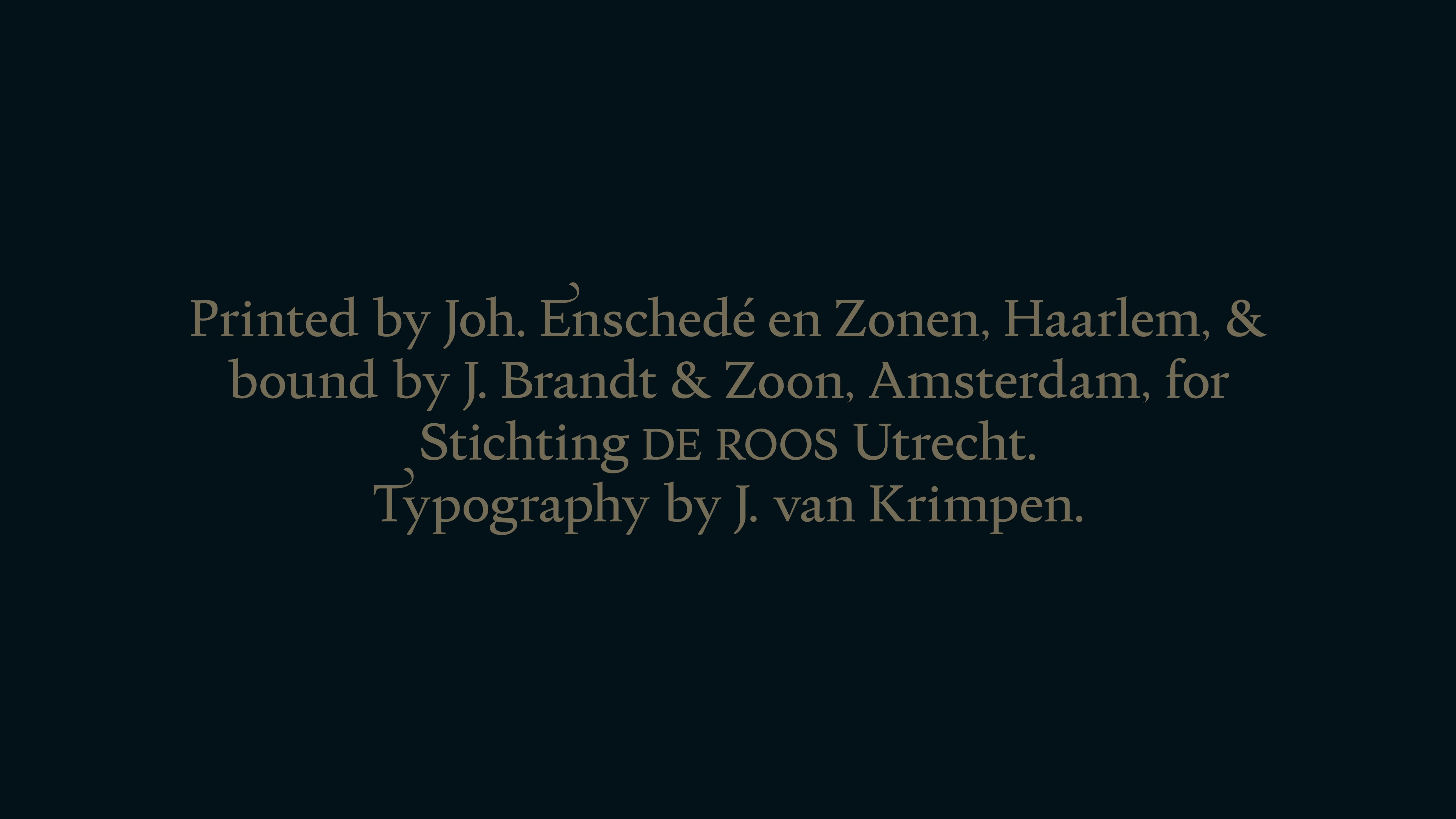
FH Paragraaf is a contemporary serif typeface inspired by the broad-nib calligraphic roots of Dutch typography and early serif explorations such as FH Phemister and FH Ronaldson. Initiated in February 2020, the design traces its spark back to Hendrik van den Keere’s Canon Romain specimen, drawing further rationale from the works of Gerrit Noordzij, Bram de Does, and Jan van Krimpen. By bridging the human tactile qualities of hand-drawn letterforms with digital precision, FH Paragraaf is engineered to produce a harmonious grey tone in continuous body text.

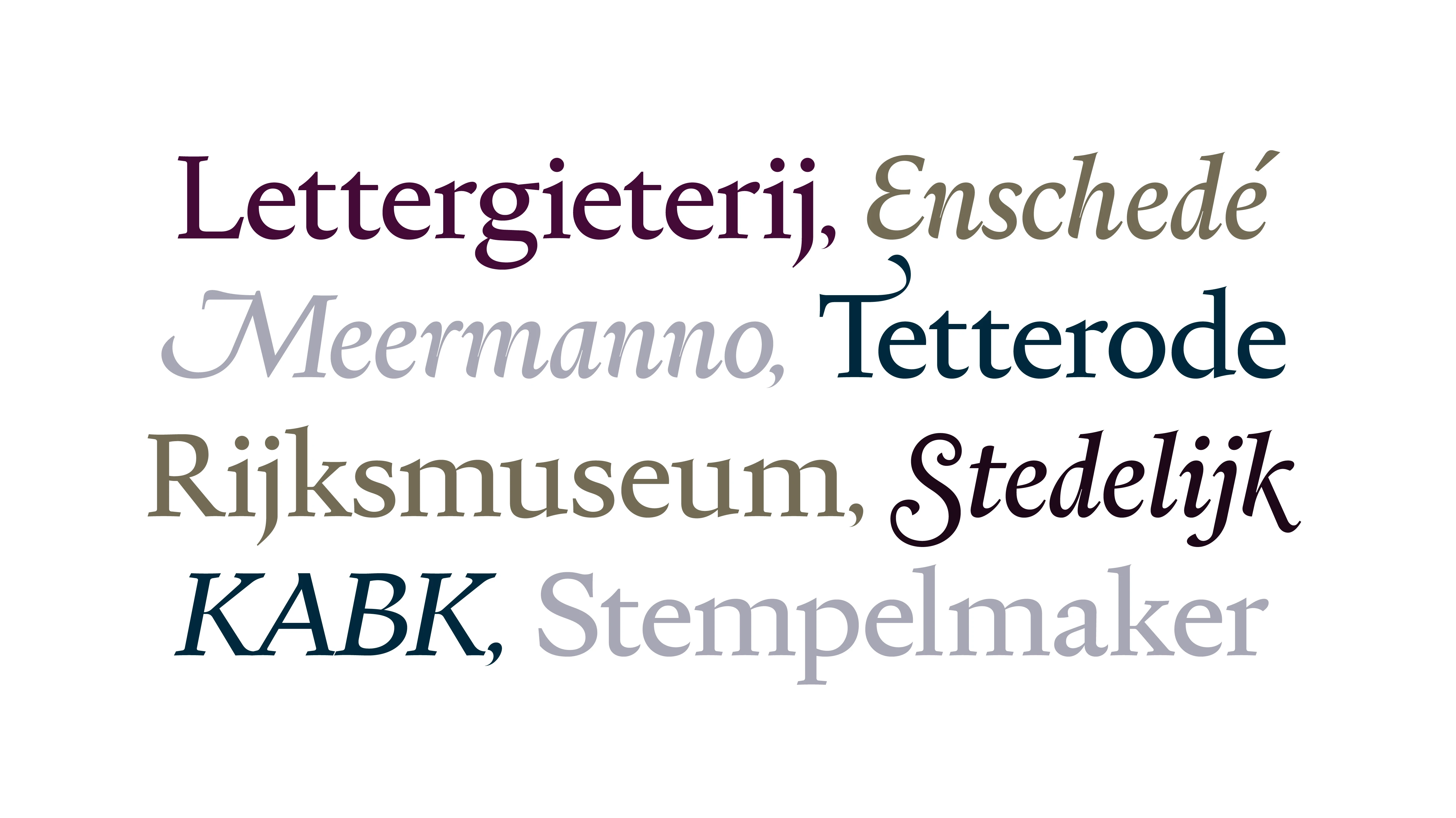
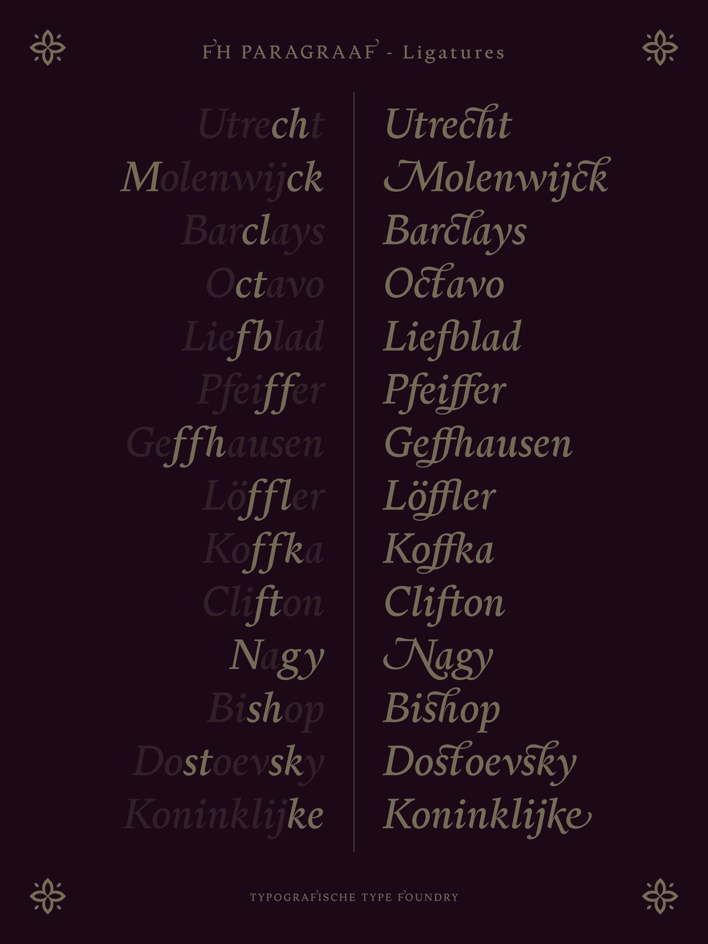
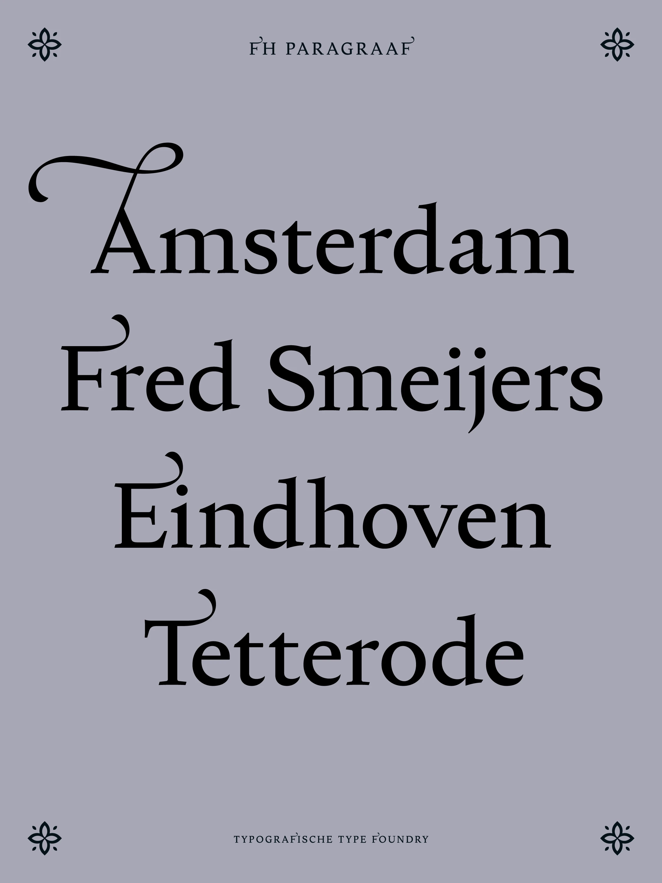
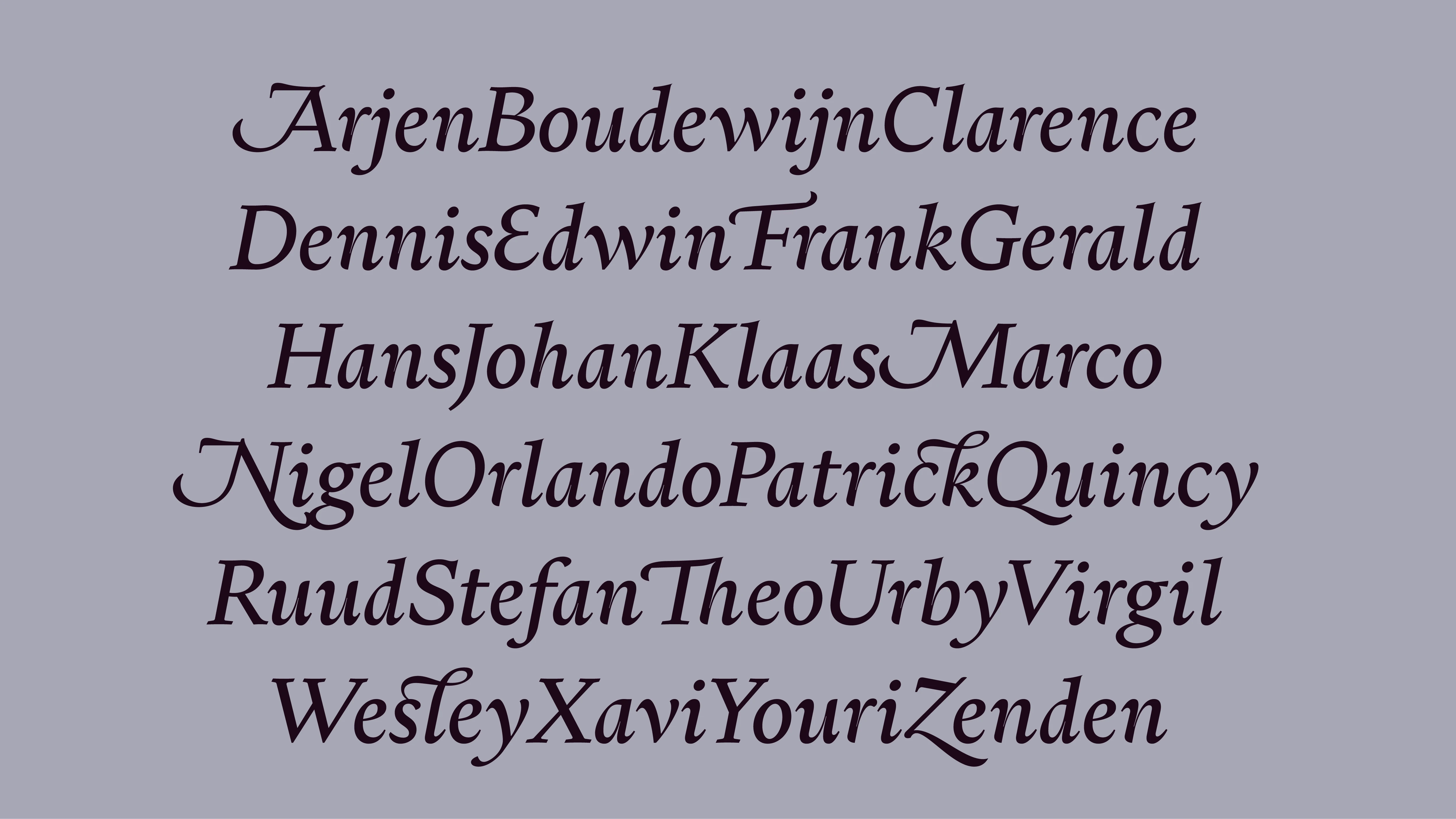
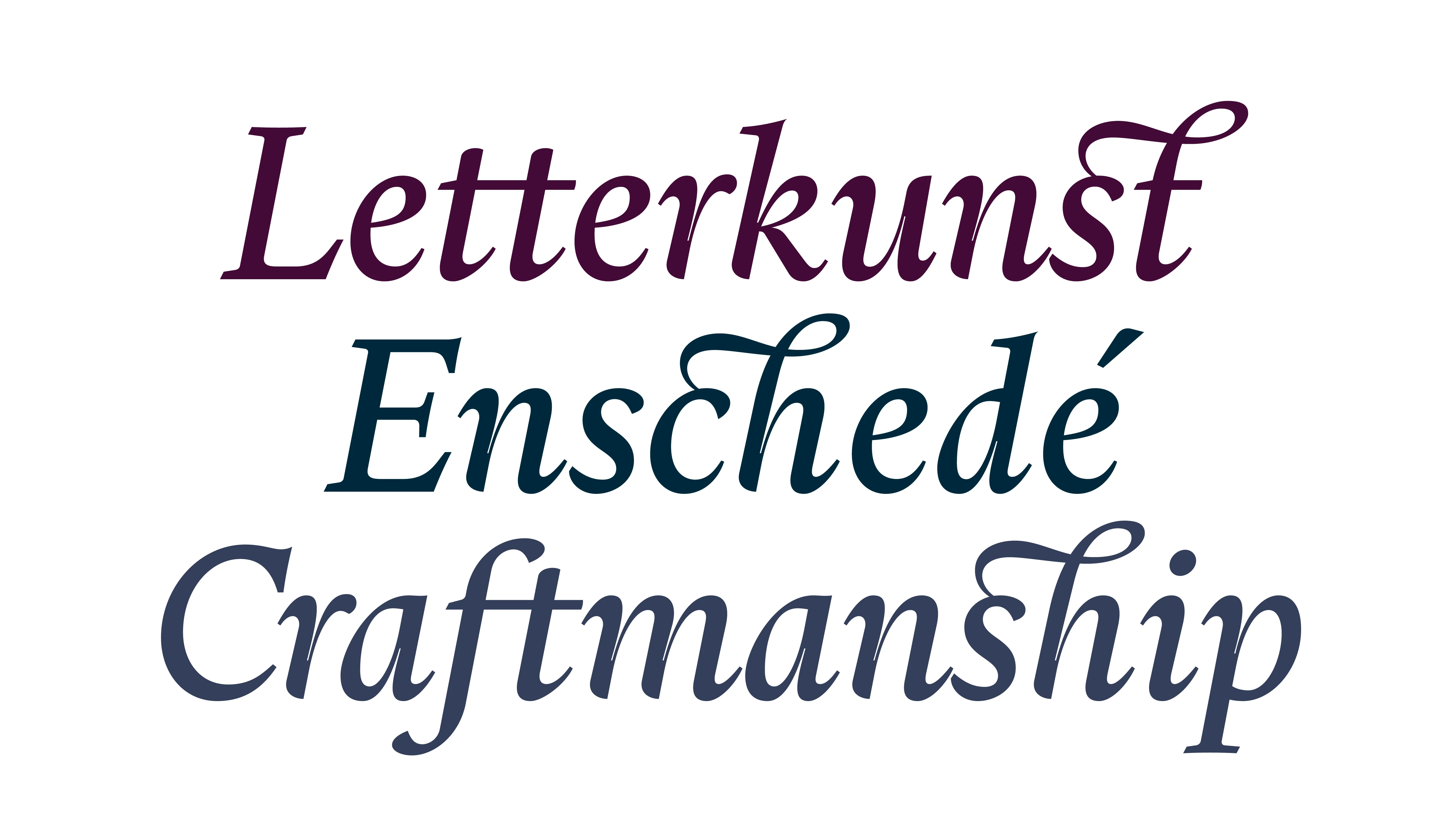
Unfolding through years of form analysis between 2020 and 2026, the typeface incorporates subtle calligraphic strokes, organic curve transitions, and custom ligatures. Alongside a curated set of swashes inspired by traditional Dutch book-cover lettering. Rather than strictly adhering to historical revivalism, FH Paragraaf translates the expressive logic of classical calligraphy into a structured, highly legible text face tailored for modern publication and digital displays.

Initially launched with its core Roman and Italic styles, FH Paragraaf provides a complete editorial foundation, with additional weights and expansions scheduled to join the catalog over time. From dense book typography to expressive titling layouts, it serves as an authoritative, fluid voice across print and digital media.

Technical Details

Release date: 2026

Current version: 1.000

Classification: Text Serif / Calligraphic Old Style

Font formats: OTF, WOFF2
28
Axes
Features
1.4
0.000

Lettergieterij

28
Axes
Features
1.4
0.000

Stempelmaker

60
Axes
Features
1.2
-0.010

The creation of Lexicon by Bram de Does represents one of the highest achievements in modern Dutch type design. Commissioned originally for the Van Dale Dictionary, the typeface was engineered to perform flawlessly at extremely small point sizes without losing its distinct personality. De Does approached the design not through mathematical abstraction, but through an intuitive mastery of rhythm, stroke contrast, and counter-space proportions. Every character in Lexicon reflects the historic authority of Joh. Enschedé’s traditional punchcutting heritage, refined for contemporary digital phototypesetting. The harmony between its upright forms and subtly rhythmic italics creates an unmistakable texture on the page a dense, highly legible text gray that allows long-form literature to breathe effortlessly.

60
Axes
Features
1.2
-0.010

According to Gerrit Noordzij, typography is fundamentally rooted in the stroke of the writing instrument. In his seminal work, The Stroke, Noordzij argues that all letterforms. Whether serif, sans-serif, broad-nib, or pointed-pen are generated by continuous spatial movement rather than static geometric construction. The white space inside and around the letter is just as active as the black stroke itself. A typeface does not consist of isolated, beautifully sculpted glyphs placed next to one another; it is a coherent system of rhythmic interruptions of the white paper. To master type design, one must not merely draw shapes, but govern the dynamic relationship between black ink, white counter-space, and the structural cadence of written language.

🔠 Glyphs
28
Axes
Features
1.4
0.000

Lettergieterij

28
Axes
Features
1.4
0.000

Stempelmaker

18
Axes
Features
1.2
-0.010

The creation of Lexicon by Bram de Does represents one of the highest achievements in modern Dutch type design. Commissioned originally for the Van Dale Dictionary, the typeface was engineered to perform flawlessly at extremely small point sizes without losing its distinct personality. De Does approached the design not through mathematical abstraction, but through an intuitive mastery of rhythm, stroke contrast, and counter-space proportions. Every character in Lexicon reflects the historic authority of Joh. Enschedé’s traditional punchcutting heritage, refined for contemporary digital phototypesetting. The harmony between its upright forms and subtly rhythmic italics creates an unmistakable texture on the page a dense, highly legible text gray that allows long-form literature to breathe effortlessly.

18
Axes
Features
1.2
-0.010

According to Gerrit Noordzij, typography is fundamentally rooted in the stroke of the writing instrument. In his seminal work, The Stroke, Noordzij argues that all letterforms. Whether serif, sans-serif, broad-nib, or pointed-pen are generated by continuous spatial movement rather than static geometric construction. The white space inside and around the letter is just as active as the black stroke itself. A typeface does not consist of isolated, beautifully sculpted glyphs placed next to one another; it is a coherent system of rhythmic interruptions of the white paper. To master type design, one must not merely draw shapes, but govern the dynamic relationship between black ink, white counter-space, and the structural cadence of written language.

🔠 Glyphs