Gallery →


Jump to
Styles →
Light
Light
Light
Regular
Regular
Regular
Medium
Medium
Medium
Semi Bold
Semi Bold
Semi Bold
Bold
Bold
Bold
Black
Black
Black
Light Italic
Light Italic
Light Italic
Regular Italic
Regular Italic
Regular Italic
Medium Italic
Medium Italic
Medium Italic
Semi Bold Italic
Semi Bold Italic
Semi Bold Italic
Bold Italic
Bold Italic
Bold Italic
Black Italic
Black Italic
Black Italic
Information
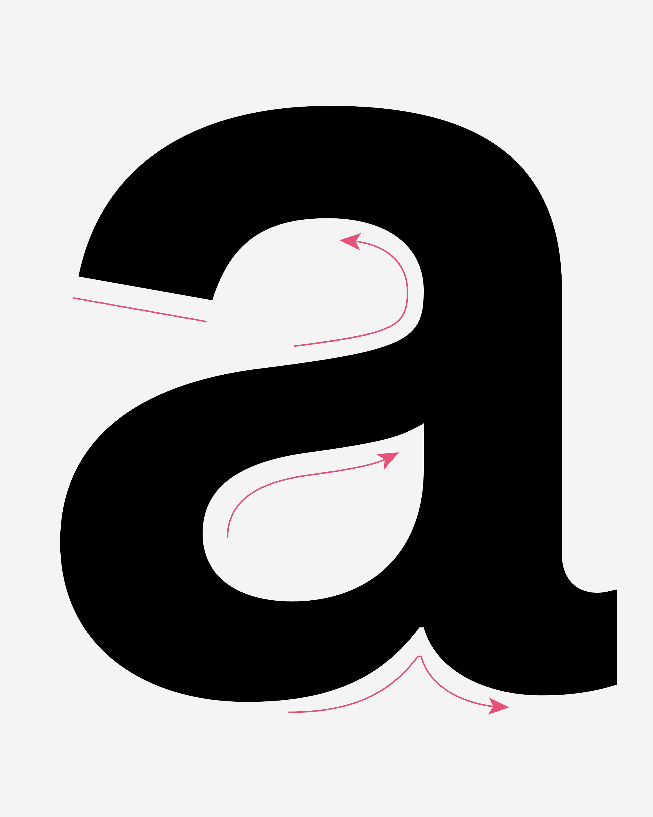
FH Dfaalt is a contemporary sans-serif typeface inspired by Breite Grotesk, Akzidenz Grotesk, Neue Haas Grotesk, and Helvetica crafted as a timeless and universal font family that balances neutrality with modern clarity. Designed with the intention of being a true “default” typeface, FH Dfaalt avoids unnecessary stylistic exaggerations and instead focuses on functional simplicity, versatility, and precision. It exists to serve as a neutral foundation for communication, adapting seamlessly across print, screen, branding, and editorial design without imposing a distinct personality, embodying the essence of a modern, context-independent type family.
Kwadraatblad
Typomuseum
Rijkmuseum
Letterkundig
Nederlandse
Graphic Unit
Typografische
BauhausArch
Internationale
ZürcherKuns
Architectuur
KoninklijkeA
The posters of the Stedelijk Museum in Amsterdam represent one of the purest manifestations of Wim Crouwel’s grid-based philosophy. In these layouts, every line, every alignment, and every typographic decision is orchestrated with mathematical discipline. Crouwel reduced visual communication to its bare elements dpace, structure, and typography creating a language that still feels progressive decades later. The Stedelijk posters prove how a strict grid can produce an unexpected sense of freedom, rhythm, and clarity.
At the Schule für Gestaltung in Basel, the foundations of the Swiss Typographic Style were established with unprecedented precision. Under the guidance of Emil Ruder, Armin Hofmann, and Wolfgang Weingart, typography became a system governed by order, hierarchy, and readability. Their teaching methods shaped generations of designers, turning Basel into the birthplace of a visual language that transcended borders. The influence of the school continues today, not only through printed matter but also through the design of contemporary interfaces and global brands.
The Staatliches Bauhaus in Weimar and Dessau reshaped European modernism by merging typography, architecture, and design into a single functional ethos. Its radical approach dismissed ornamentation in favor of structure and utility, allowing form to emerge from purpose. The Bauhaus created a new relationship between technology and craft, inspiring modular type experiments, strict geometric compositions, and the foundations of modern graphic design education. Its legacy still informs typographic thinking around reduction and clarity.
Gerard Unger’s work redefined the boundaries between readability and contemporary form. Through typefaces like Swift, Gulliver, and Capitolium, he demonstrated how subtle optical adjustments can transform complex content into accessible text. His designs shaped newspapers, signage systems, and public interfaces across Europe, proving that functionality and personality can coexist. Unger’s ability to refine rhythm, spacing, and proportions gave typographers new tools for making long-form reading both efficient and visually engaging.
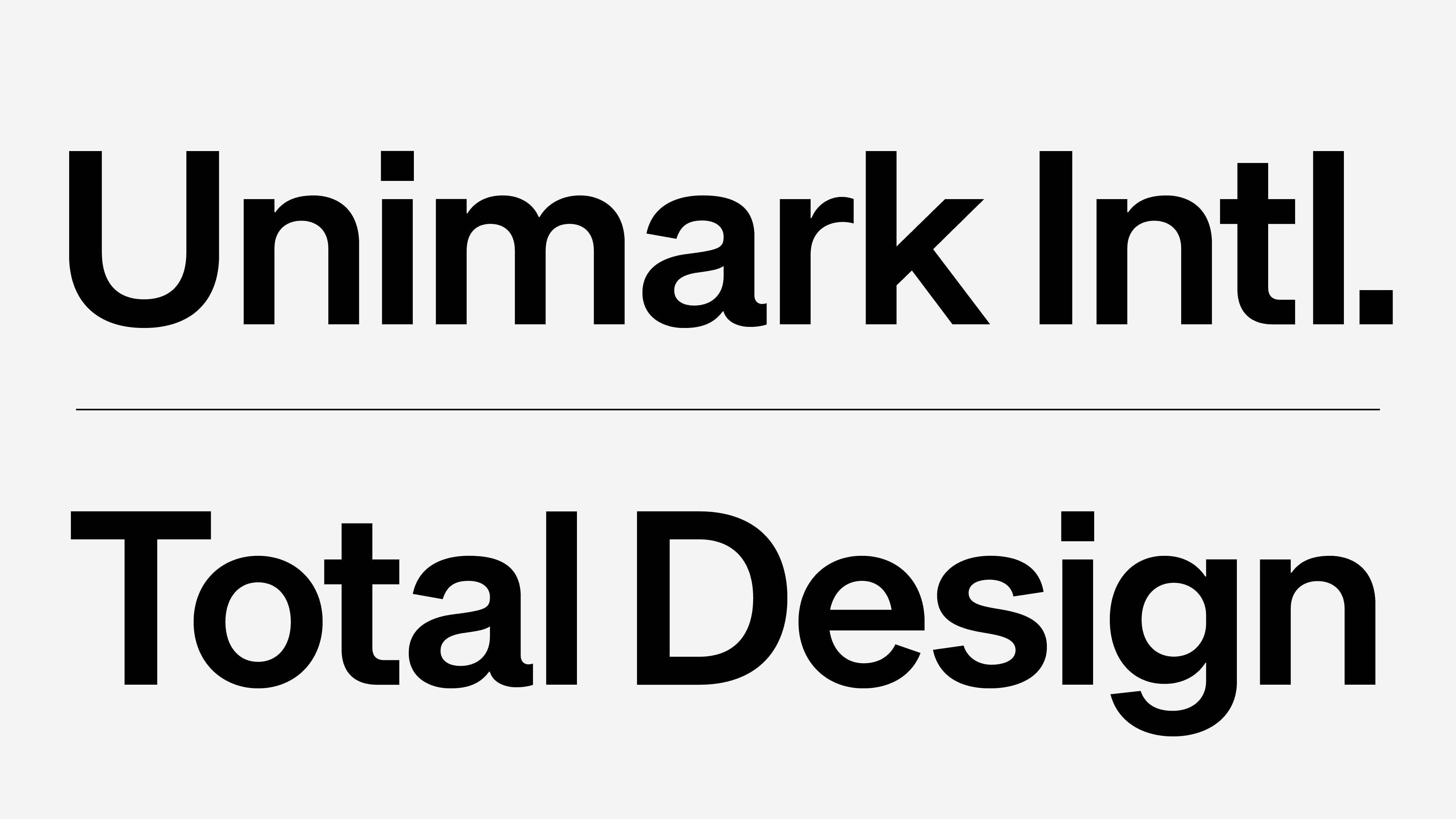
Total Design, founded in Amsterdam in 1963, established a new standard for corporate identity systems. Working with clients such as Nederlandse Spoorwegen, Randstad, and PTT, the studio created visual frameworks rooted in consistency and modular thinking. Their methodology combined typography, grid systems, photography, and signage into holistic identities decades before the term “branding” became commonplace. Total Design’s influence marked the transition from intuitive graphic design to a rational, systematic discipline.
The Lettergieterij Joh. Enschedé in Haarlem played a crucial role in Dutch printing and type history. For centuries, the foundry produced high-quality typefaces, banknotes, and security printing that required unmatched precision. Its archives chronicle a unique marriage of craftsmanship and innovation, reflecting the evolution of typographic technology from metal type to digital formats. Enschedé stands as a testament to how tradition can continually adapt to new tools and cultural shifts.
Jan van Krimpen developed typefaces that balanced the elegance of classical calligraphy with the restraint demanded by contemporary book design. His work, including Romulus, Haarlemmer, and Spectrum, embodied a clarity rooted in hand-drawn sensibility. Van Krimpen’s analytical approach to form, spacing, and proportion continues to guide designers seeking harmony between text flow and visual refinement. His influence is particularly strong in editorial typography and fine book printing.
Akzidenz Grotesk, released by H. Berthold AG, laid the foundation for the modern grotesk category. Its straightforward, industrial character removed decorative tendencies in favor of direct communication. The typeface found a home in signage systems, early corporate identities, and the emerging field of information design. Its neutral tone and strong structural logic paved the way for later neo-grotesks, shaping the visual identity of the 20th century.
Helvetica emerged in the 1950s as a synthesis of Swiss modernist principles clarity, neutrality, and adaptability. Designed to function across all scales and contexts, it rapidly became the international voice of corporations, governments, and transportation systems. The typeface’s cautious refinement of curves, counters, and spacing demonstrated how neutrality could itself become a powerful aesthetic. Helvetica’s global adoption set new expectations for legibility and brand consistency.
Across Dutch cities, public signage systems reflect the nation's long-standing commitment to typographic order. From transportation networks to municipal communications, these systems blend legibility, modularity, and cultural character. Designers like Gerard Unger and Jurriaan Schrofer contributed to a national visual language rooted in precision and pragmatism. These systems show how type is not only aesthetic but also infrastructural guiding movement, orientation, and comprehension.
Transit typography demands clarity under pressure speed, crowds, distance, and fatigue. Modern transit identities across Europe adopted principles derived from Swiss and Dutch modernism to ensure fast, frictionless comprehension. Narrow apertures were avoided, spacing was optimized for glance reading, and weights were calibrated for illuminated and reflective surfaces. The result is a typographic discipline where form follows the urgency of public movement.
Today's new grotesks continue a dialogue with their historical predecessors while pushing beyond neutrality. Contemporary designers reinterpret early industrial forms through optical refinements, variable axes, and digital precision. The genre’s evolution demonstrates how the modernist search for clarity still resonates yet now in interfaces, streaming platforms, automobiles, and global brands. The grotesk remains a living examination of rhythm, order, and universality.
🔠 Glyphs
Kwadraatblad
Typomuseum
Rijkmuseum
Letterkundig
Nederlandse
Graphic Unit
Typografische
BauhausArch
Internationale
ZürcherKuns
Architectuur
KoninklijkeA
The posters of the Stedelijk Museum in Amsterdam represent one of the purest manifestations of Wim Crouwel’s grid-based philosophy. In these layouts, every line, every alignment, and every typographic decision is orchestrated with mathematical discipline. Crouwel reduced visual communication to its bare elements dpace, structure, and typography creating a language that still feels progressive decades later. The Stedelijk posters prove how a strict grid can produce an unexpected sense of freedom, rhythm, and clarity.
At the Schule für Gestaltung in Basel, the foundations of the Swiss Typographic Style were established with unprecedented precision. Under the guidance of Emil Ruder, Armin Hofmann, and Wolfgang Weingart, typography became a system governed by order, hierarchy, and readability. Their teaching methods shaped generations of designers, turning Basel into the birthplace of a visual language that transcended borders. The influence of the school continues today, not only through printed matter but also through the design of contemporary interfaces and global brands.
The Staatliches Bauhaus in Weimar and Dessau reshaped European modernism by merging typography, architecture, and design into a single functional ethos. Its radical approach dismissed ornamentation in favor of structure and utility, allowing form to emerge from purpose. The Bauhaus created a new relationship between technology and craft, inspiring modular type experiments, strict geometric compositions, and the foundations of modern graphic design education. Its legacy still informs typographic thinking around reduction and clarity.
Gerard Unger’s work redefined the boundaries between readability and contemporary form. Through typefaces like Swift, Gulliver, and Capitolium, he demonstrated how subtle optical adjustments can transform complex content into accessible text. His designs shaped newspapers, signage systems, and public interfaces across Europe, proving that functionality and personality can coexist. Unger’s ability to refine rhythm, spacing, and proportions gave typographers new tools for making long-form reading both efficient and visually engaging.
Total Design, founded in Amsterdam in 1963, established a new standard for corporate identity systems. Working with clients such as Nederlandse Spoorwegen, Randstad, and PTT, the studio created visual frameworks rooted in consistency and modular thinking. Their methodology combined typography, grid systems, photography, and signage into holistic identities decades before the term “branding” became commonplace. Total Design’s influence marked the transition from intuitive graphic design to a rational, systematic discipline.
The Lettergieterij Joh. Enschedé in Haarlem played a crucial role in Dutch printing and type history. For centuries, the foundry produced high-quality typefaces, banknotes, and security printing that required unmatched precision. Its archives chronicle a unique marriage of craftsmanship and innovation, reflecting the evolution of typographic technology from metal type to digital formats. Enschedé stands as a testament to how tradition can continually adapt to new tools and cultural shifts.
Jan van Krimpen developed typefaces that balanced the elegance of classical calligraphy with the restraint demanded by contemporary book design. His work, including Romulus, Haarlemmer, and Spectrum, embodied a clarity rooted in hand-drawn sensibility. Van Krimpen’s analytical approach to form, spacing, and proportion continues to guide designers seeking harmony between text flow and visual refinement. His influence is particularly strong in editorial typography and fine book printing.
Akzidenz Grotesk, released by H. Berthold AG, laid the foundation for the modern grotesk category. Its straightforward, industrial character removed decorative tendencies in favor of direct communication. The typeface found a home in signage systems, early corporate identities, and the emerging field of information design. Its neutral tone and strong structural logic paved the way for later neo-grotesks, shaping the visual identity of the 20th century.
Helvetica emerged in the 1950s as a synthesis of Swiss modernist principles clarity, neutrality, and adaptability. Designed to function across all scales and contexts, it rapidly became the international voice of corporations, governments, and transportation systems. The typeface’s cautious refinement of curves, counters, and spacing demonstrated how neutrality could itself become a powerful aesthetic. Helvetica’s global adoption set new expectations for legibility and brand consistency.
Across Dutch cities, public signage systems reflect the nation's long-standing commitment to typographic order. From transportation networks to municipal communications, these systems blend legibility, modularity, and cultural character. Designers like Gerard Unger and Jurriaan Schrofer contributed to a national visual language rooted in precision and pragmatism. These systems show how type is not only aesthetic but also infrastructural guiding movement, orientation, and comprehension.
Transit typography demands clarity under pressure speed, crowds, distance, and fatigue. Modern transit identities across Europe adopted principles derived from Swiss and Dutch modernism to ensure fast, frictionless comprehension. Narrow apertures were avoided, spacing was optimized for glance reading, and weights were calibrated for illuminated and reflective surfaces. The result is a typographic discipline where form follows the urgency of public movement.
Today's new grotesks continue a dialogue with their historical predecessors while pushing beyond neutrality. Contemporary designers reinterpret early industrial forms through optical refinements, variable axes, and digital precision. The genre’s evolution demonstrates how the modernist search for clarity still resonates yet now in interfaces, streaming platforms, automobiles, and global brands. The grotesk remains a living examination of rhythm, order, and universality.
🔠 Glyphs


Typografische
Information
Typografische
Typografische