Gallery →


Jump to
Styles →
Information
FH Lecturis is a neo-grotesk inspired by the rational grid systems of Wim Crouwel and the structural clarity of Akzidenz Grotesk. Drawn with modular precision, it softens its rigid core through rounded terminals and subtle optical adjustments. The result is a typeface that balances mechanical order with humanist warmth. Designed for editorial systems, institutional identities, and visual clarity at scale, FH Lecturis is where logic meets nuance.
Akademist
Mondriaan
Eindhoven
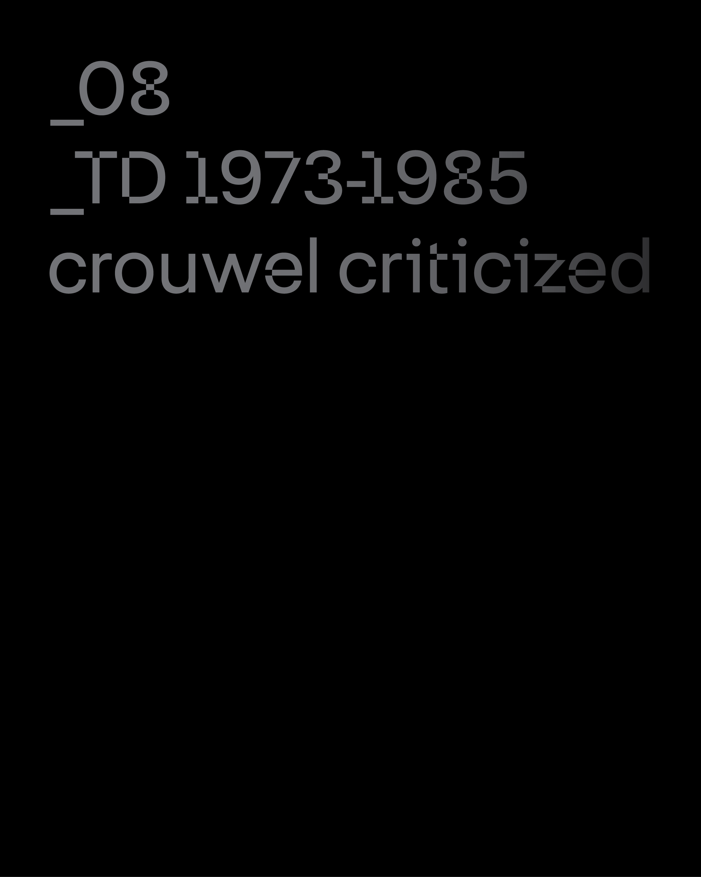
Wim Crouwel believed in structure, not decoration. For him, design was never about ornament or personal flourish, but about building clear systems that could organise information with precision. His work reduced visual noise to pure function, stripping away unnecessary elements to reveal the underlying logic of communication. Through carefully constructed grid systems, he brought discipline and order to the page. In doing so, he offered clarity in a chaotic visual world, demonstrating how typography and structure could guide the eye and stabilise complex information.
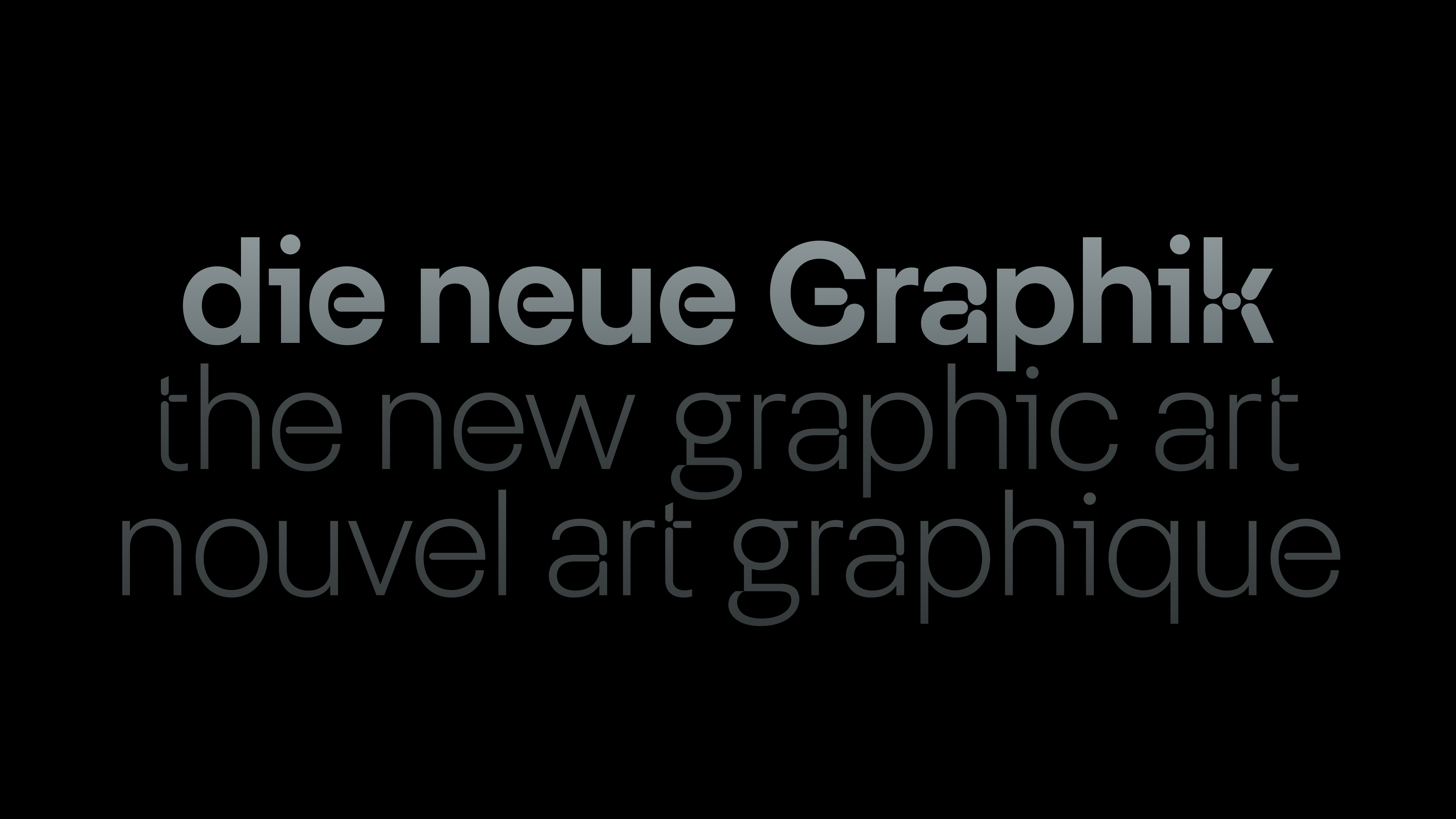
Crouwel’s approach reflected a broader Dutch tradition that valued clarity, order and rational thinking. Influenced by modernist principles and the legacy of De Stijl, he treated design as a structured system rather than an expressive gesture. Typography, in this context, became a precise instrument for communication. Every element letters, spacing and alignment was positioned with intention, allowing information to unfold with rhythm and balance across the page.
This philosophy reached its most radical expression in Crouwel’s experimental work. Projects such as the New Alphabet pushed the limits of legibility, questioning how far a system could define the form of letters themselves. Even in these explorations, structure remained central. Geometry, grids and modular logic shaped every decision, revealing how design could function both as a tool for communication and as a reflection of technological culture.
🔠 Glyphs
Akademist
Mondriaan
Eindhoven
Wim Crouwel believed in structure, not decoration. For him, design was never about ornament or personal flourish, but about building clear systems that could organise information with precision. His work reduced visual noise to pure function, stripping away unnecessary elements to reveal the underlying logic of communication. Through carefully constructed grid systems, he brought discipline and order to the page. In doing so, he offered clarity in a chaotic visual world, demonstrating how typography and structure could guide the eye and stabilise complex information.
Crouwel’s approach reflected a broader Dutch tradition that valued clarity, order and rational thinking. Influenced by modernist principles and the legacy of De Stijl, he treated design as a structured system rather than an expressive gesture. Typography, in this context, became a precise instrument for communication. Every element letters, spacing and alignment was positioned with intention, allowing information to unfold with rhythm and balance across the page.
This philosophy reached its most radical expression in Crouwel’s experimental work. Projects such as the New Alphabet pushed the limits of legibility, questioning how far a system could define the form of letters themselves. Even in these explorations, structure remained central. Geometry, grids and modular logic shaped every decision, revealing how design could function both as a tool for communication and as a reflection of technological culture.
🔠 Glyphs


Typografische
Information
Typografische
Typografische